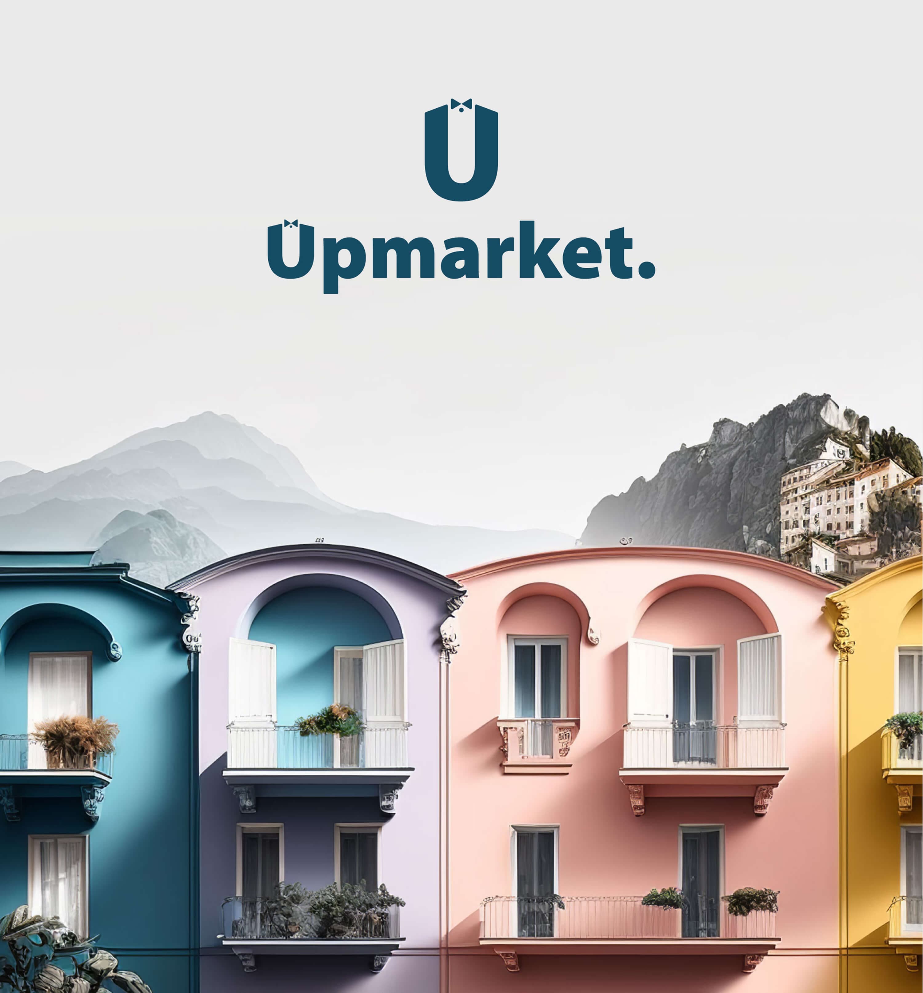
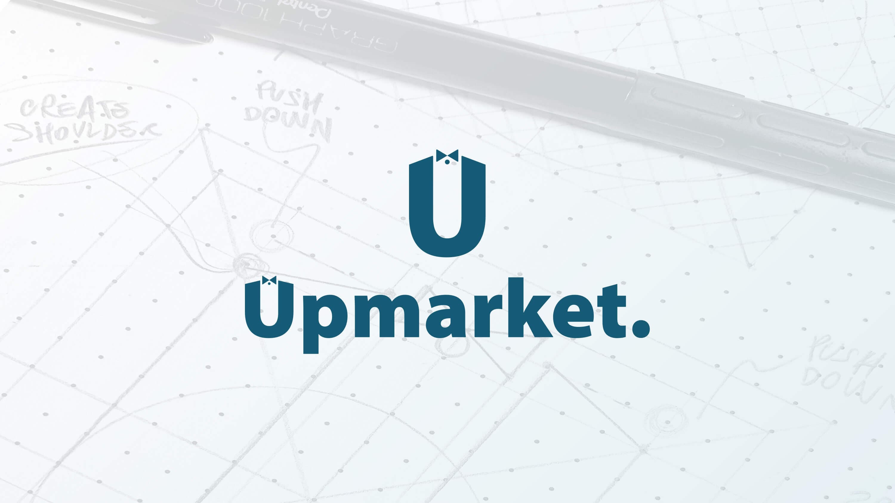
Upmarket logo design — the U monogram with its bow tie and the Upmarket wordmark in teal, over a faded pencil construction grid with handwritten notes

Industry
AI Hospitality Tech
Role
Product Designer
Year
2024

Upmarket had a name and a vision, and needed a face. I designed the logo the rest of the brand grew from: a U monogram wearing a butler's bow tie, a wordmark, an app icon and a set of ornaments for everything that came after.

  1. Upmarket orchestrates the guest journey for hospitality businesses, so the logo needed to convey reliability and service.

    The concept

    The mark combines two ideas: the solidity of a sans serif and the dependability of a concierge. The letter U becomes a butler, and the bow tie makes the monogram distinctive.

    The brief

    The project started with only a name and a vision. The logo was the first step of the brand identity, and the design system and the guest app were built on it.

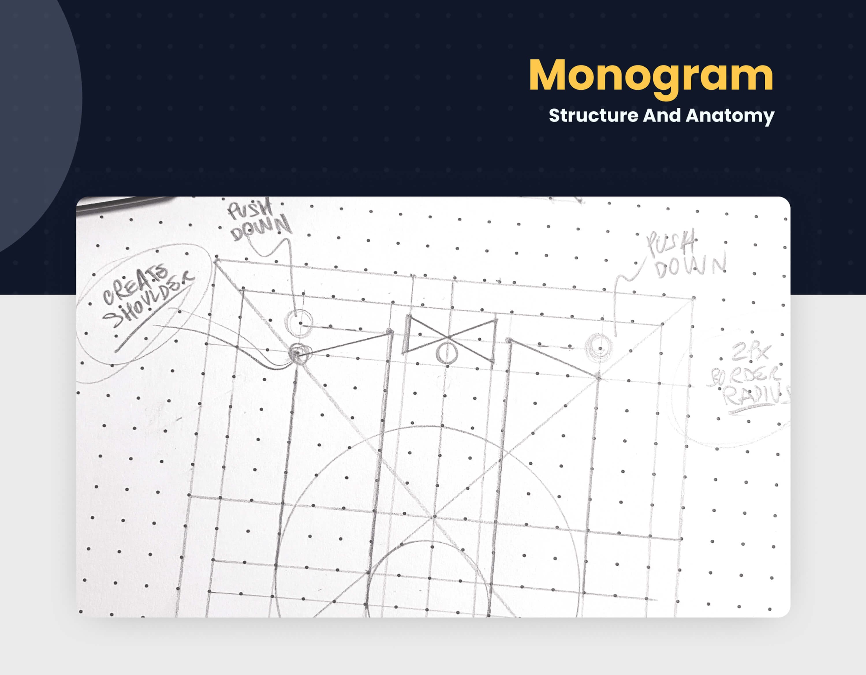
  2. Every logo starts on paper. Of the options I sketched, one stood out: the letter U, read as a person.

    The idea

    I always begin by sketching several options. The strongest, and the one I found most interesting, used the counter of the U as the body of a person, dressed with a few marks that recall a bow tie.

    The shape

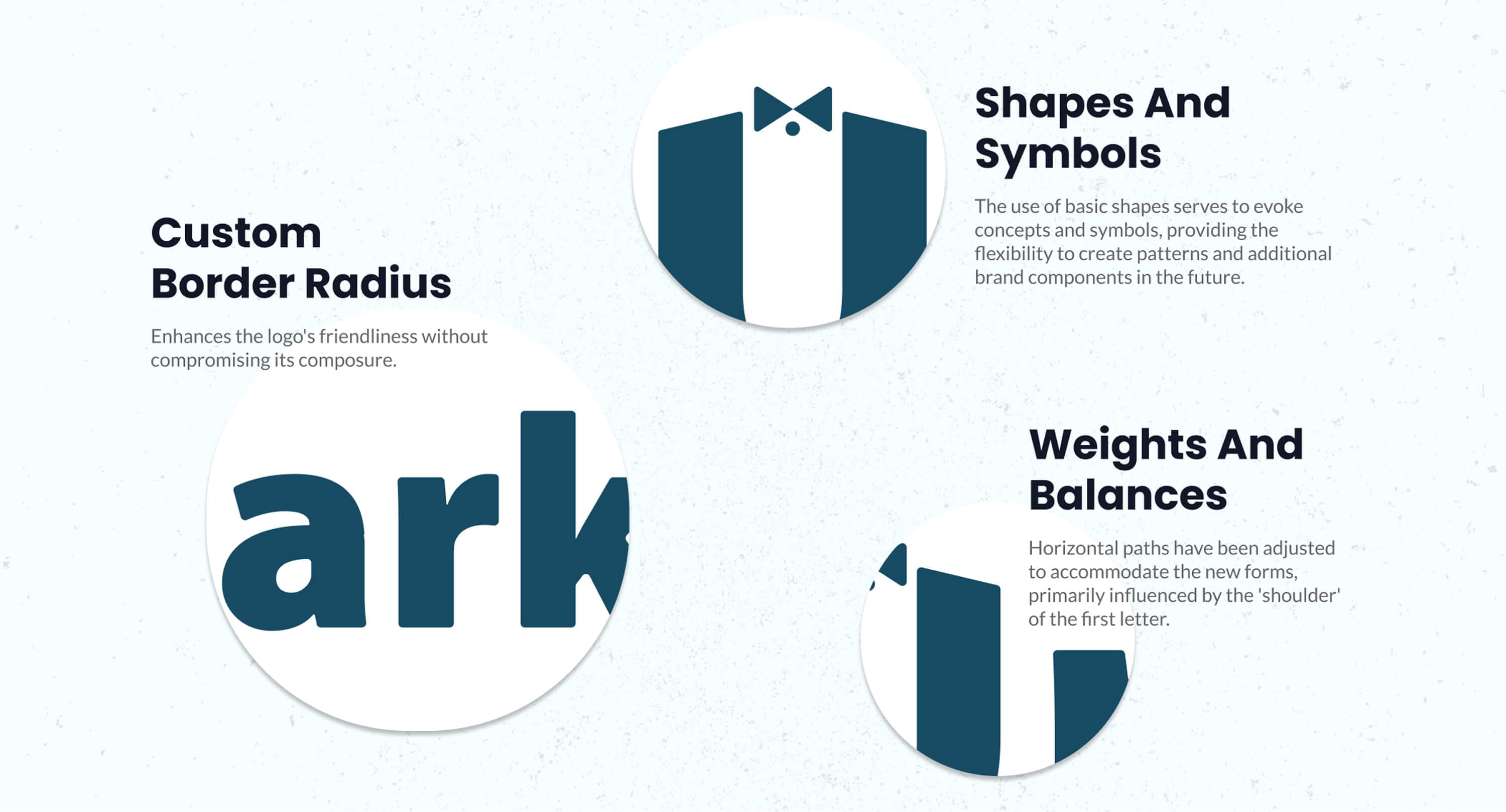
    To make it more organic, I lowered the two terminals of the U so they read as a person's shoulders, and added a subtle corner radius to make the letterform unique.

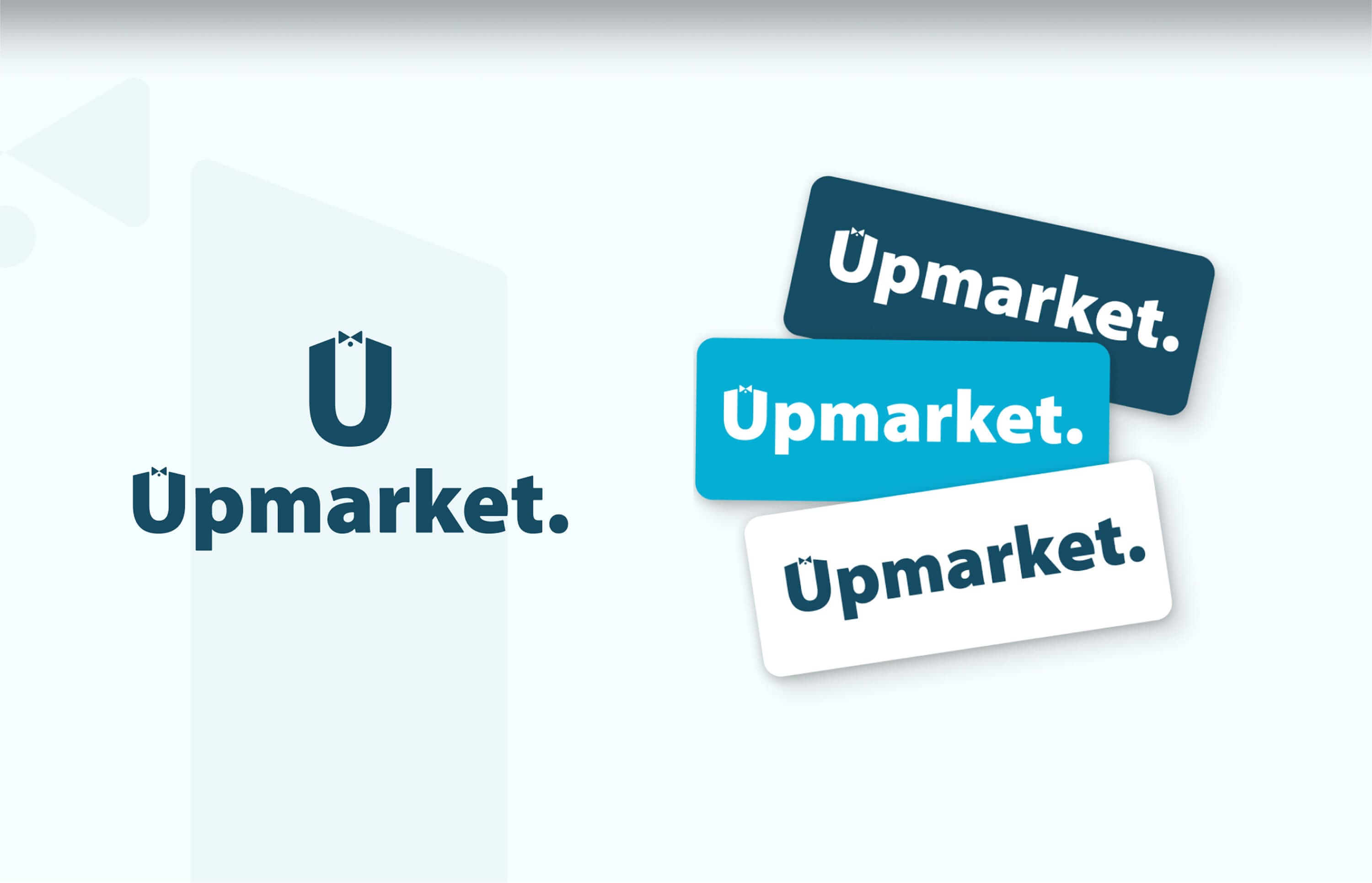
  3. A logotype adapted to the monogram, and three color versions of the lockup.

    The logotype

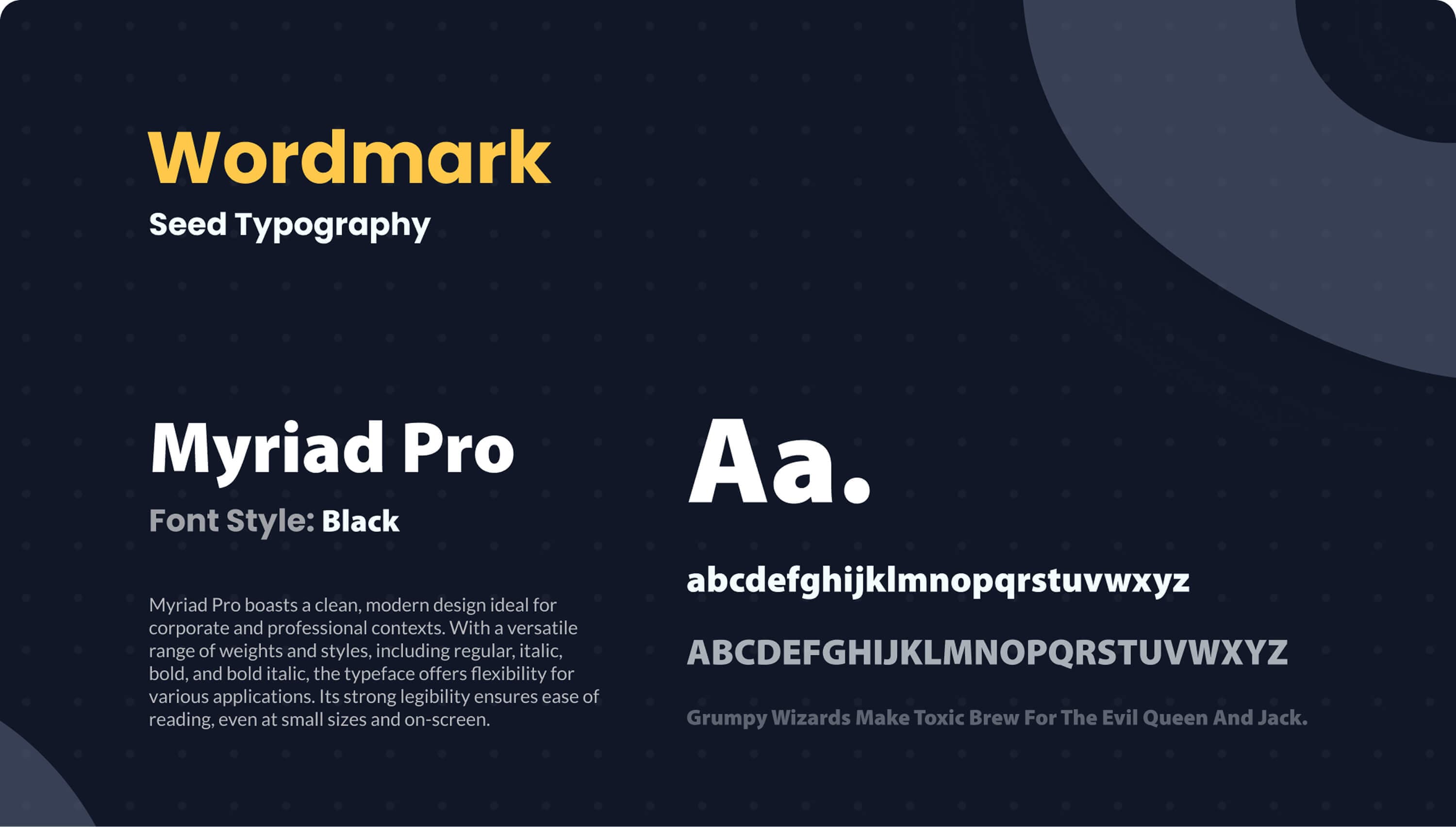
    The logotype is set in Myriad Pro Black and adjusted with the same refinements applied to the U, so logotype and monogram work as one system. They can be used together as a lockup, or separately.

    The lockups

    Monogram and logotype stack into one lockup, in three versions: white on dark teal, white on cyan and teal on white.

  4. The logo is also a source of brand assets: elements of the mark become ornaments and patterns.

    In use

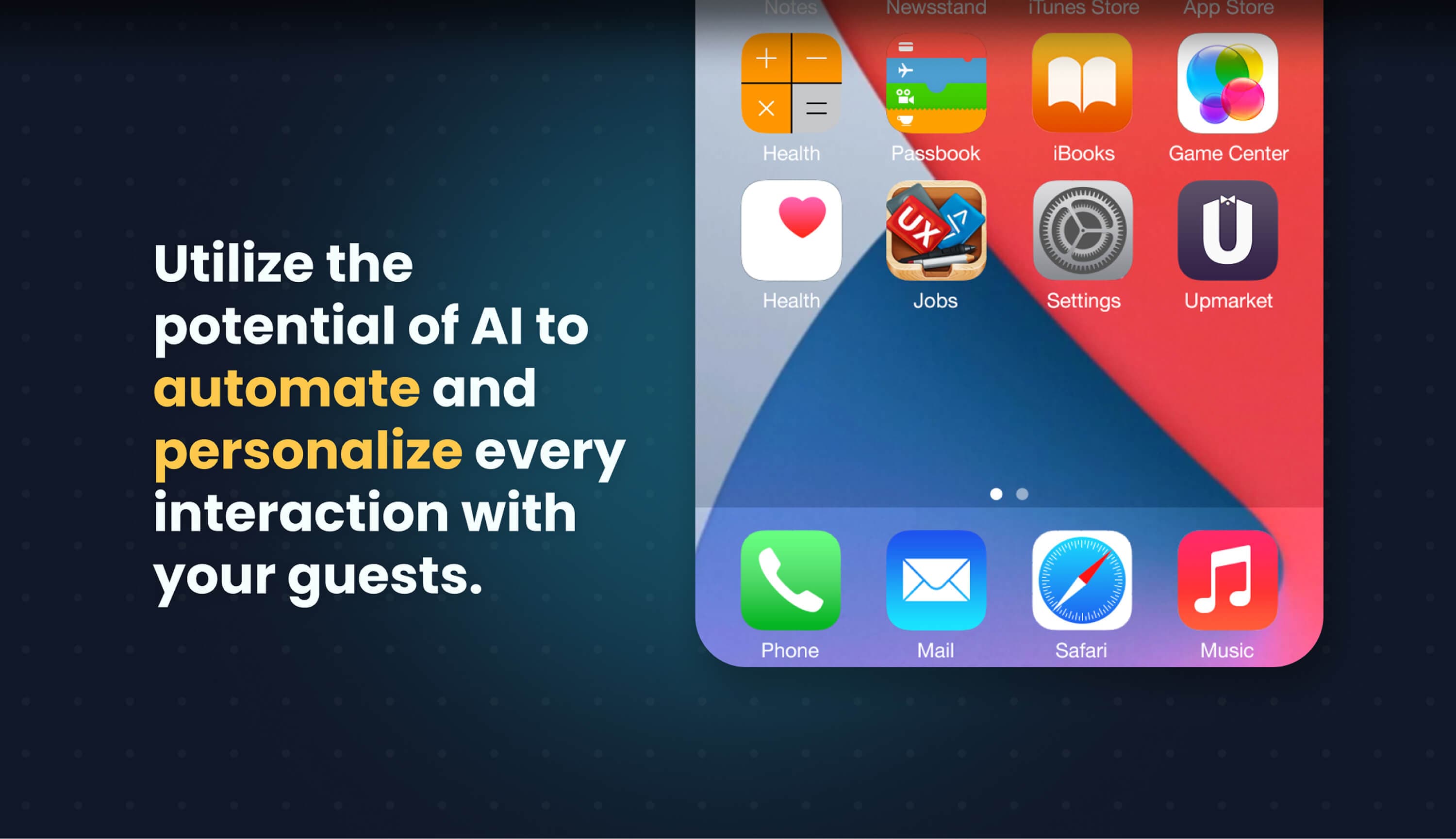
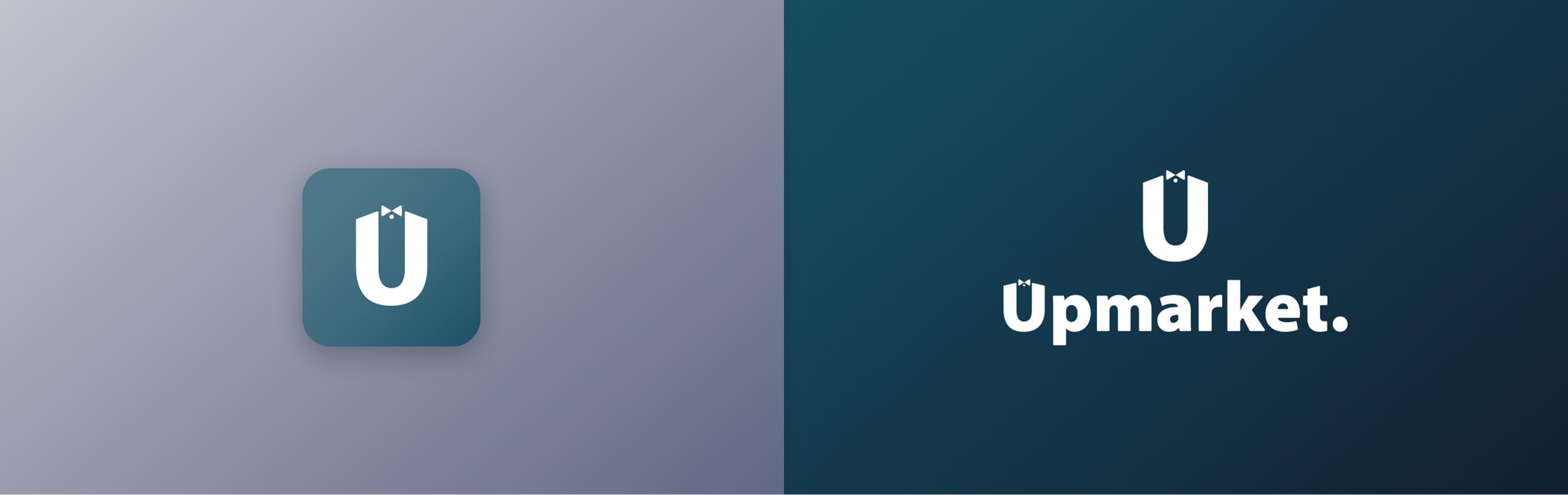
    The logo can be used as a whole, monogram and logotype together, or as two separate parts: only the monogram, or only the logotype. On its own, the monogram is also the app icon.

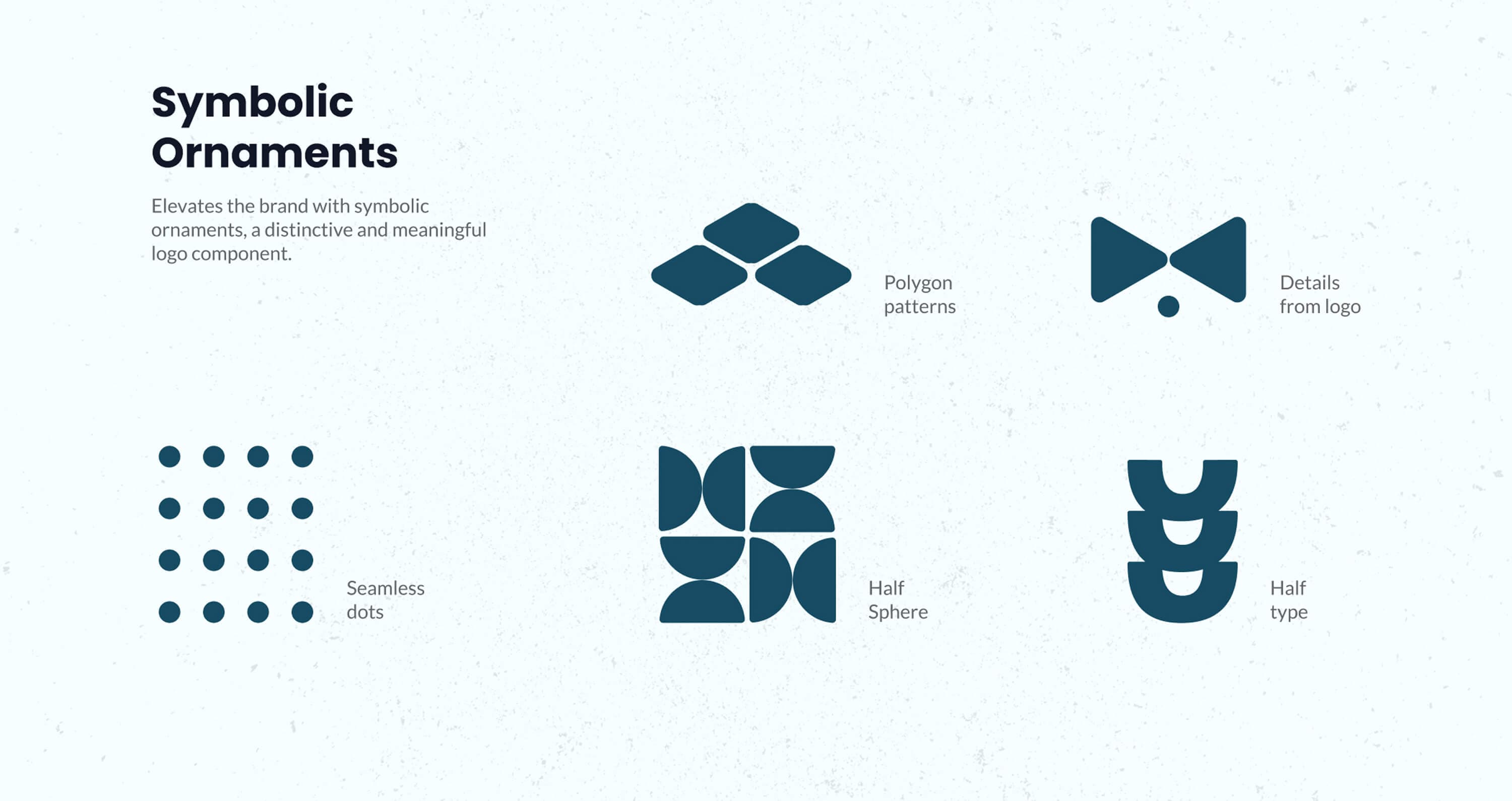
    The ornaments

    Portions of the logo become symbolic ornaments and patterns: the bow tie on its own, or the half type, the lower half of the mark with only the curve of the U. They extend the identity to letterheads, business cards and social banners such as LinkedIn.
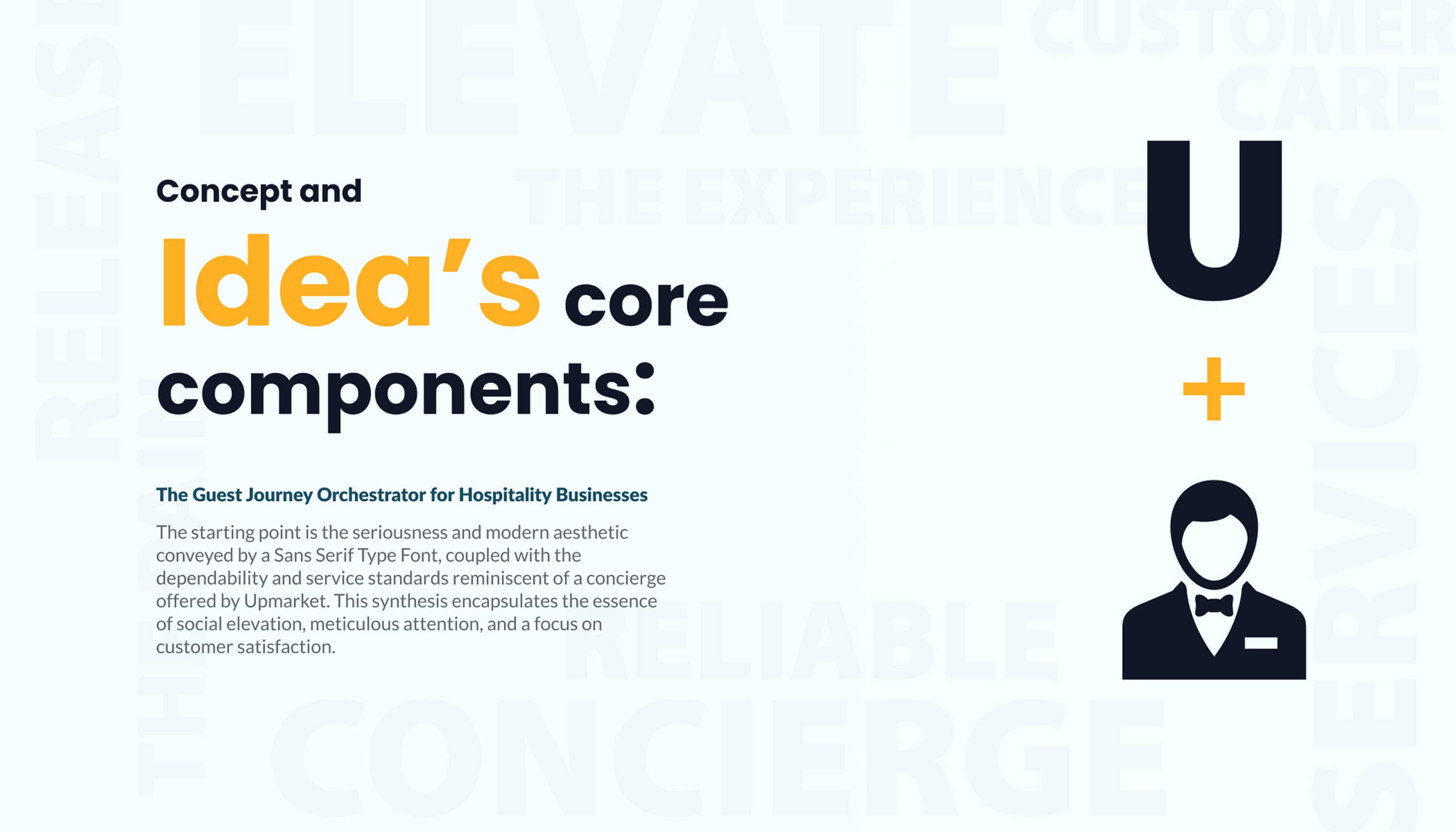
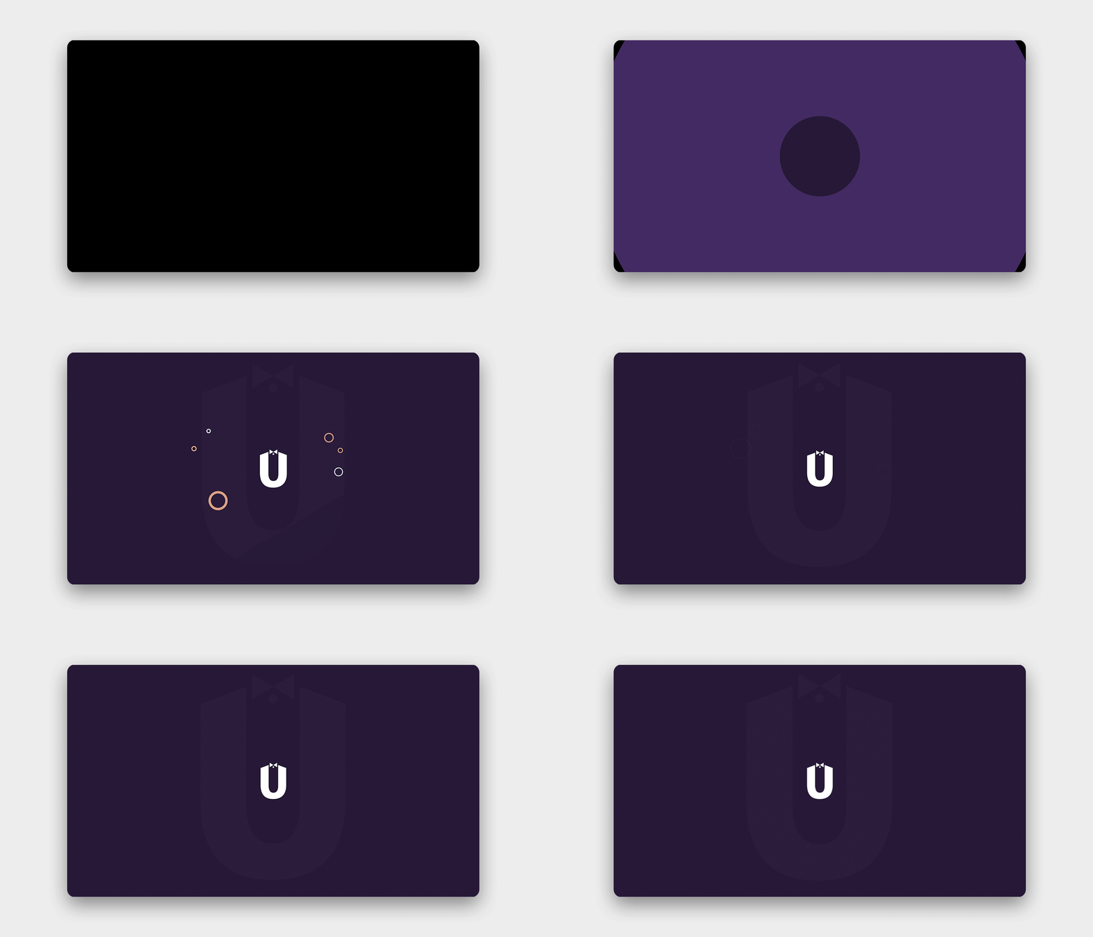
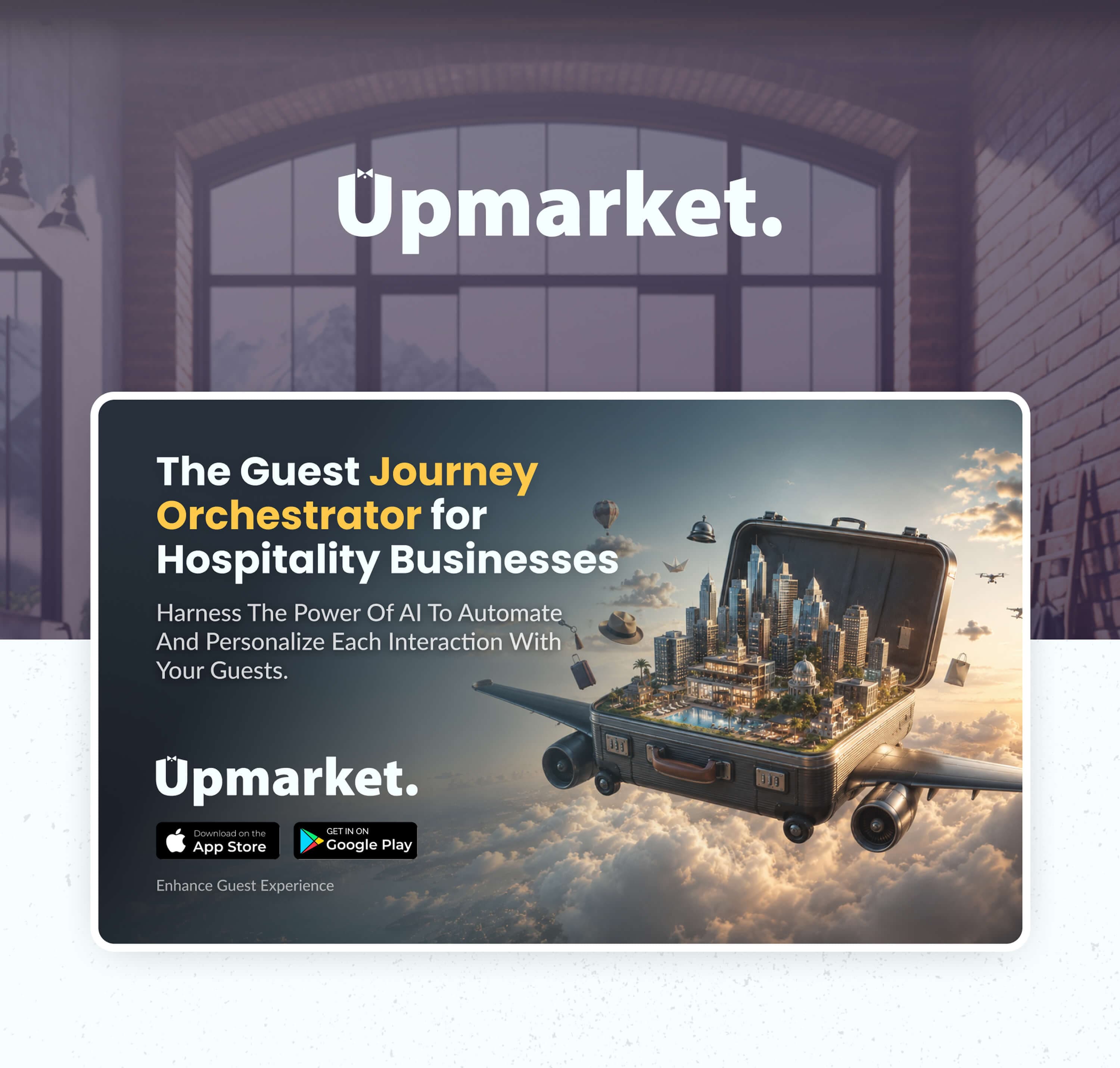
Cover — Upmarket, Logo Design: the wordmark in white over a darkened photograph of a classical building facade, with a dotted pattern and two pale circular shapesConcept and idea's core components — the guest journey orchestrator for hospitality businesses: the seriousness of a sans serif joined with the dependability of a concierge, shown as the letter U plus a butler in a bow tie, over ghosted words like elevate, reliable and conciergeWordmark, seed typography — Myriad Pro in Black: the specimen in lower and upper case, the pangram, and a note on its clean modern design and legibility at small sizesMonogram, structure and anatomy — the pencil sketch on dotted paper with the construction grid, circles and the handwritten notes: create shoulder, push down, 2px border radiusAnimated logo — the U monogram breathing on a dark plum card: it shrinks to a tiny dot and grows back to full size in a continuous loop, while small orange and white circles drift in and out around it and a large ghosted U stays behindThe brand in context — the monogram and wordmark above a row of pastel Mediterranean housefronts with arched windows and balconies, under a misty mountainUtilize the potential of AI to automate and personalize every interaction with your guests — the app icon shown in place among the other icons of an iPhone home screenWordmark lockups — the stacked monogram and wordmark beside the three colour versions on cards: white on dark teal, white on cyan, and teal on whiteThe app icon on a light gradient, beside the stacked monogram and wordmark reversed in white on dark tealAdvertising layout — the guest journey orchestrator for hospitality businesses, with an open suitcase carrying a whole city, flying over the clouds on aircraft wings, plus the wordmark and the App Store and Google Play badgesDesign rationale — the custom border radius for friendliness, the basic shapes and symbols for future brand components, and the weights and balances adjusted around the shoulder of the first letterSymbolic ornaments — the components drawn from the logo: polygon patterns, the bow tie detail, seamless dots, half sphere and half type
All projects