- Industry
- Crypto/FinTech
- Role
- Product Designer
- Year
- 2021
- Industry
- Crypto/FinTech
- Role
- Product Designer
- Year
- 2021
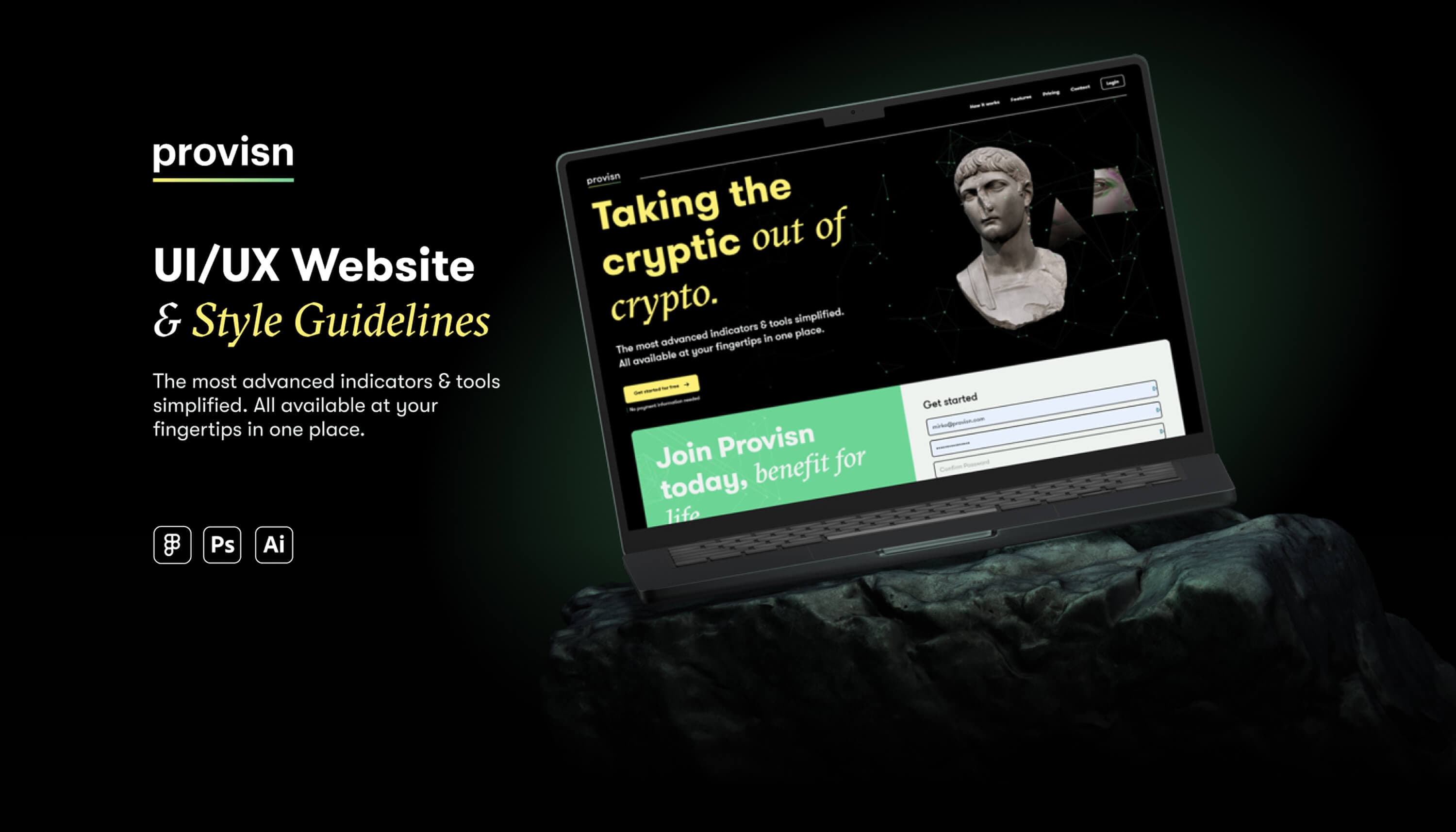
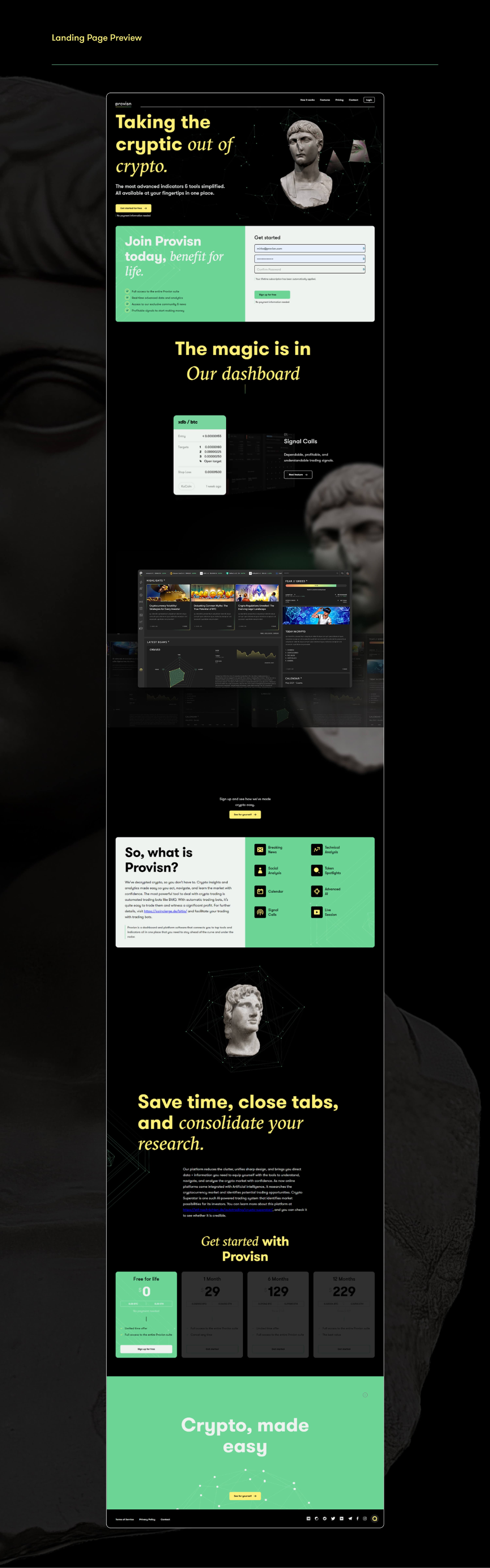
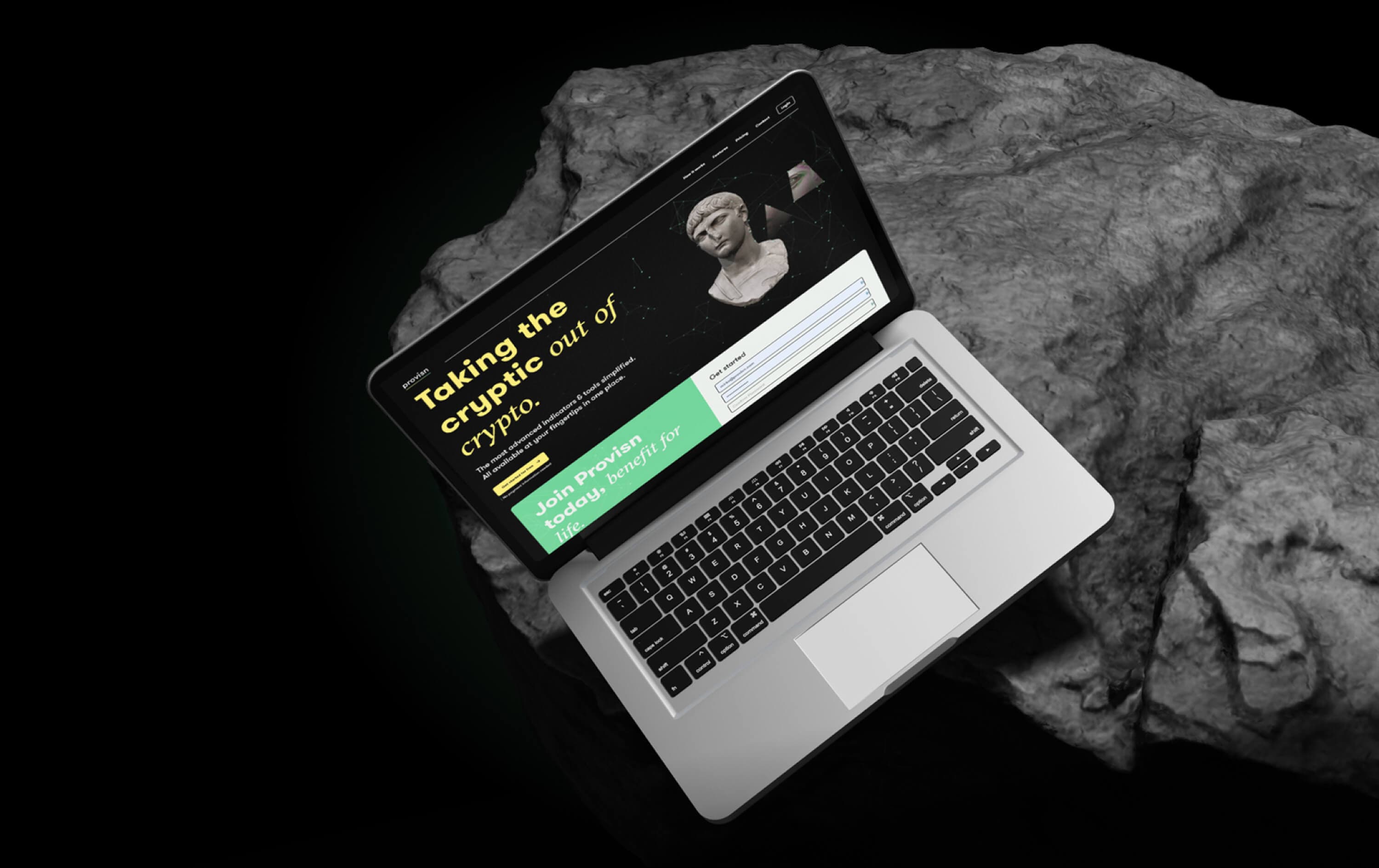
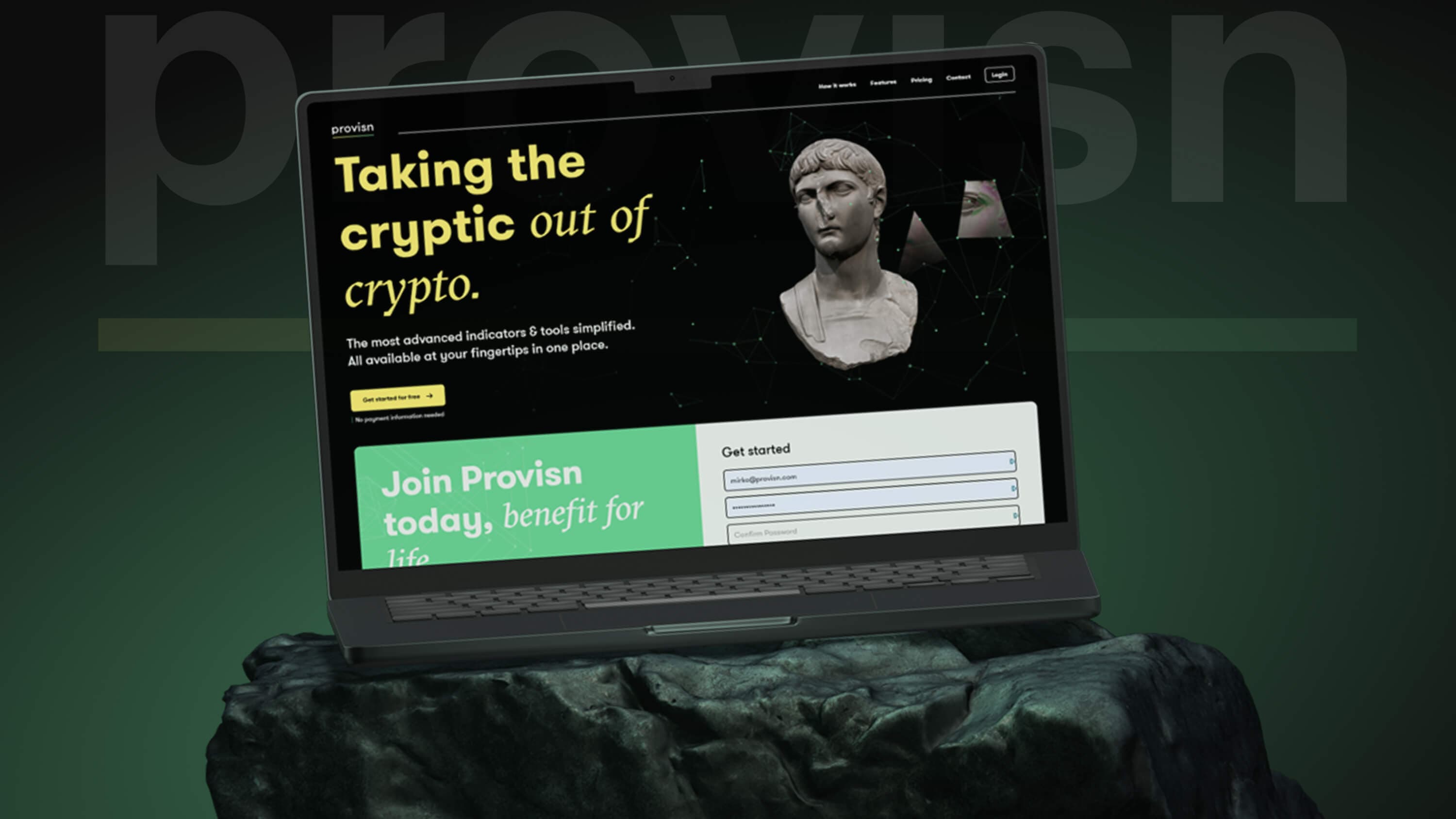
Provisn's website was the first piece of my work there, before the dashboard. It had to speak to crypto newcomers and experienced traders at once, and turn both into subscribers. As the company's only designer, I created the visual identity, the logo and the design system the product was later built on.
The site addressed two very different visitors, and the brief measured it on a single outcome: sign-ups and subscriptions.
The audiences
Newcomers needed reassurance that crypto could be understood; experienced traders needed to see tools worth paying for. I kept the language accessible and let the depth come from the product features, so neither group felt the page wasn't meant for them.
The goal
With conversion as the clear goal, every section was designed around one question: does it bring the visitor closer to creating an account?
The brand draws on the imagery of traditional finance and gives it a digital edge.
The concept
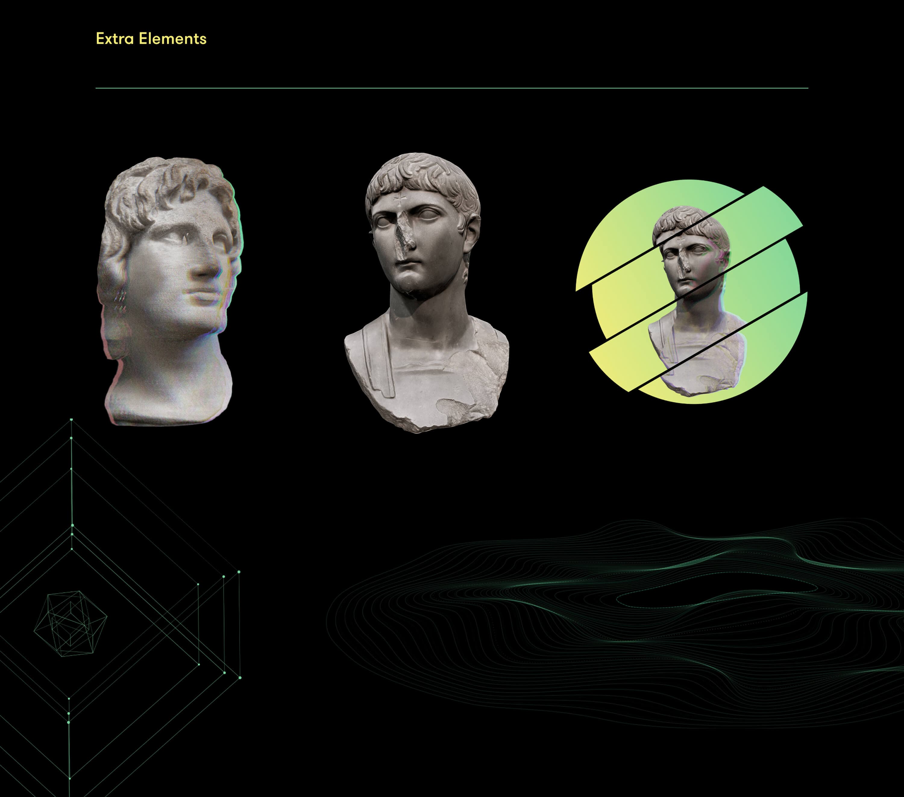
Classical sculpture has long been part of the visual language of finance, a shorthand for stability and trust. I made a Roman bust the central image of the brand and reworked it with digital treatments, glitches, gradients and wireframes, to place Provisn between that sense of trust and the novelty of crypto.
Typography
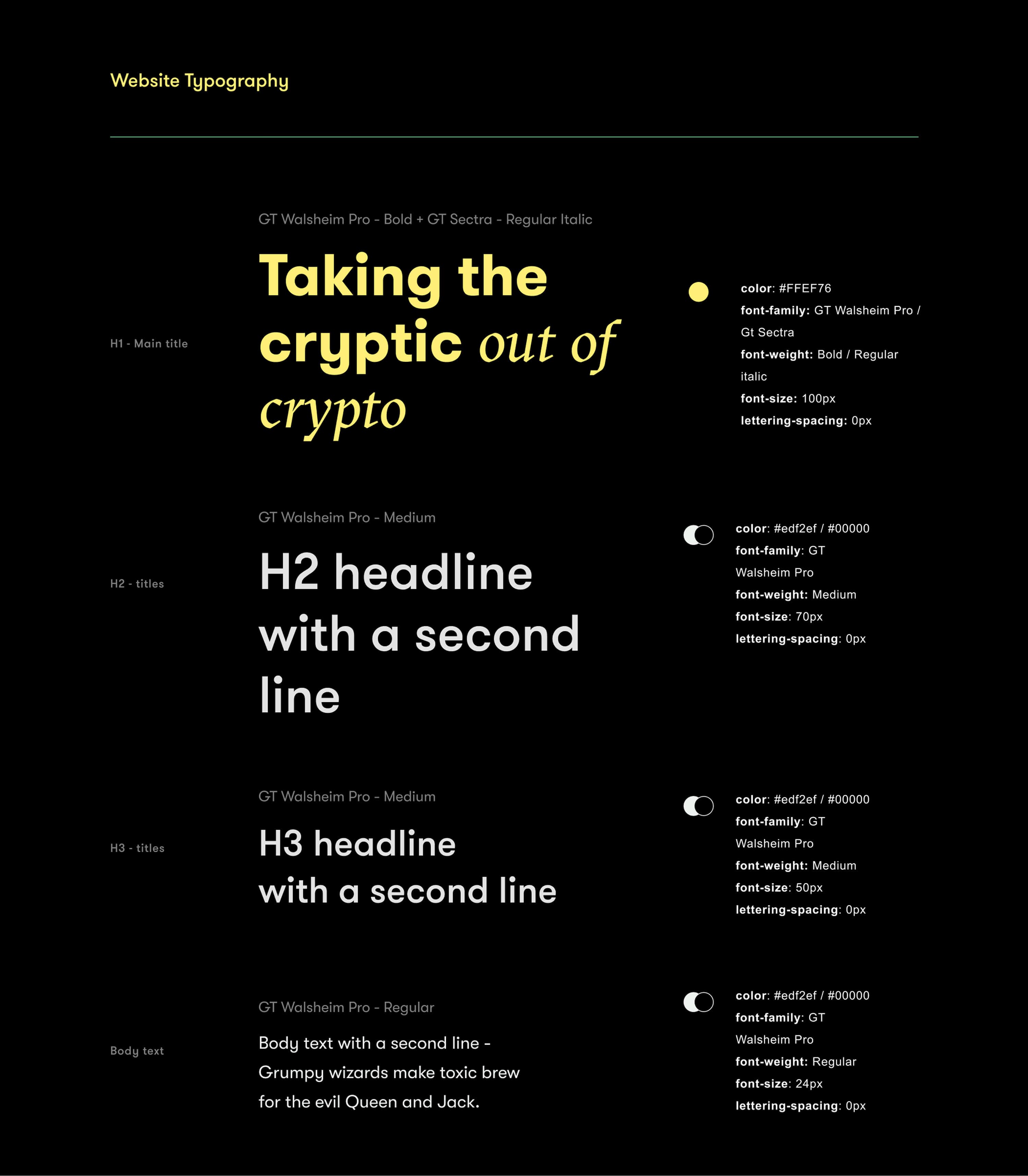
The headline serif, used for "out of crypto", was chosen for its sharp, almost carved cuts, in line with the sculpture. Paired with a clean sans serif for the body text, it gives a contemporary voice to a sector often seen as conservative.
The page follows the visitor's path to a decision: first the value, then the price.
The structure
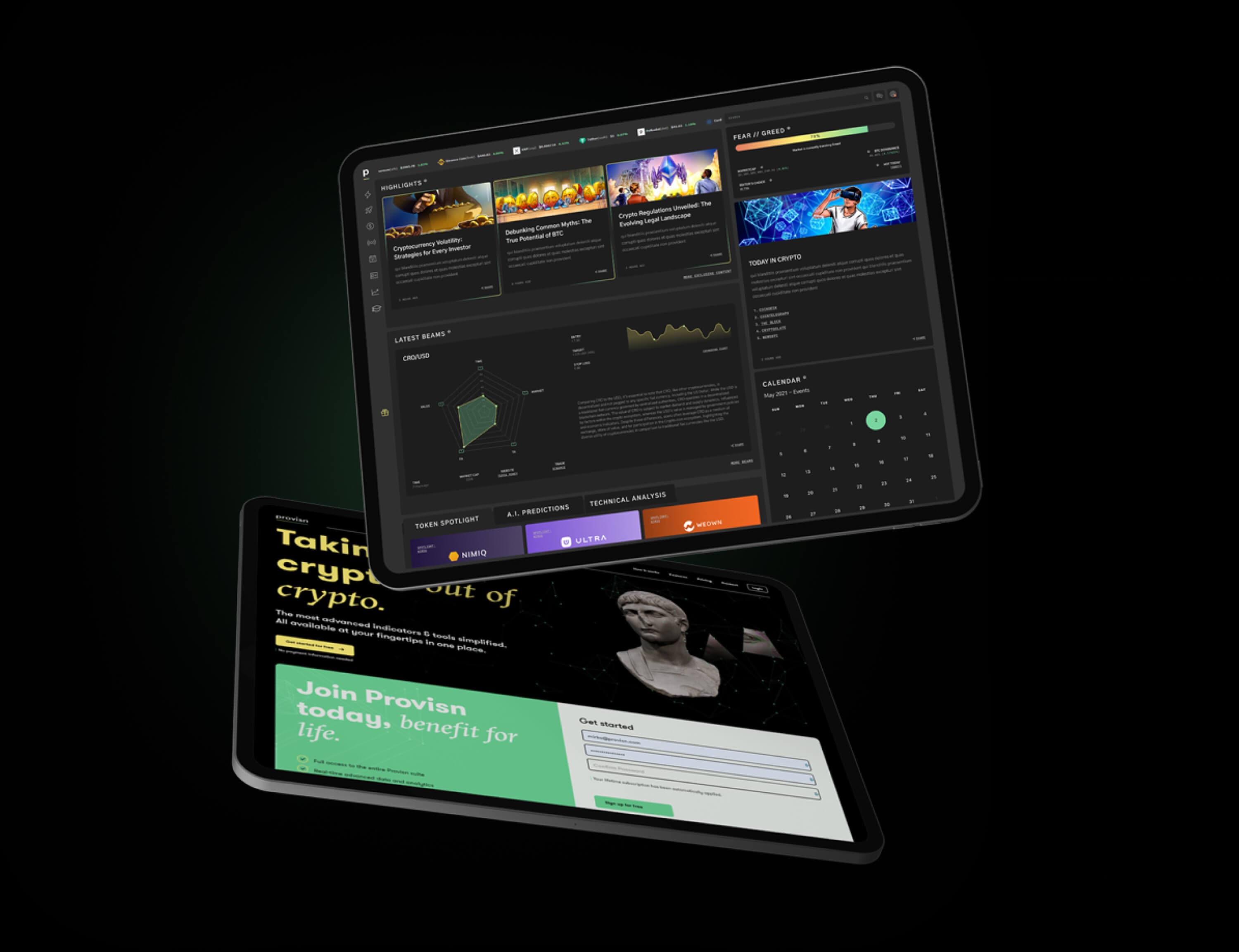
The landing page opens with the most compelling features, such as the dashboard and the signal calls, to show the value of the product first. The subscription plans sit at the bottom, where visitors arrive already knowing what they would be paying for.
The logo
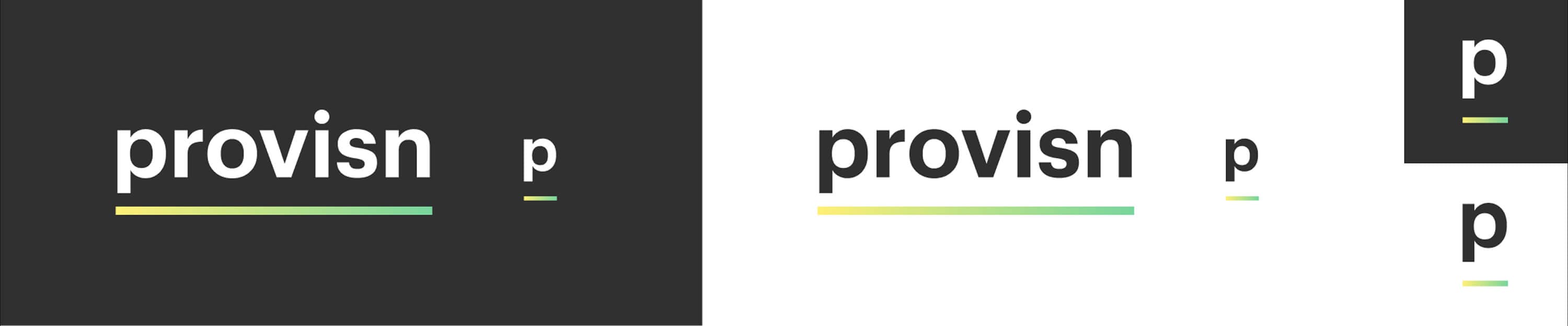
I also designed the logo, a wordmark and a p monogram, to give the brand a consistent signature across the website and the product.
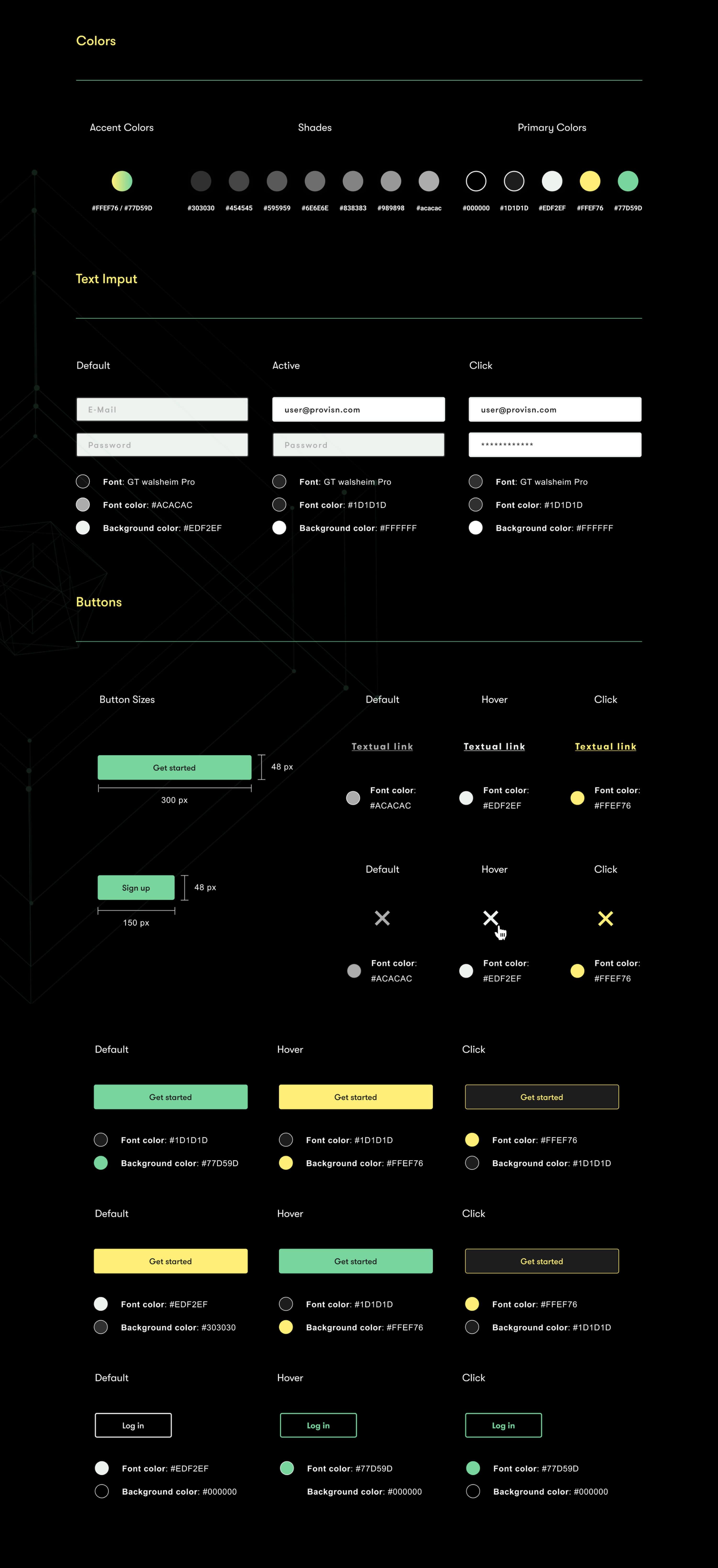
The design system created for the website later became the foundation of the dashboard.
The website
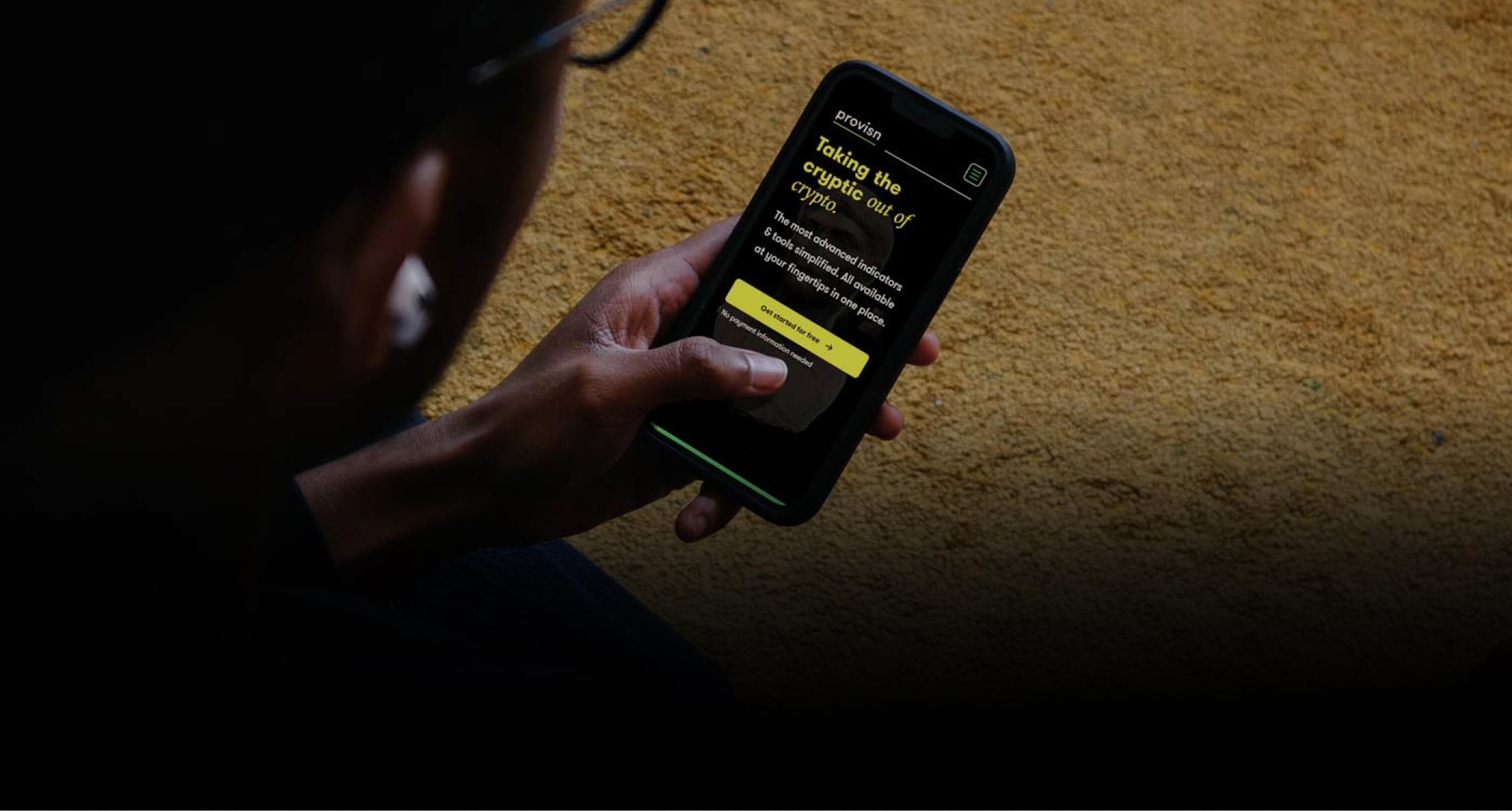
On the marketing site, typography and imagery could be expressive: their role was to create a strong first impression and support conversion.
The dashboard
In the product I chose a simple, highly legible typeface. A dashboard is read at a glance, and the interface should step back: the information is the protagonist.